In-app messages: modal, banner, sheet — pick one on purpose
Five layouts cover most jobs. The mistake is using the loudest one for everything, or sending in-app at the same moment as a push.
In-app is the channel for people who are already in the product. That is a different job from push. Treating it as "push, but inside the app" is how you get stacked modals and a disable-notifications reflex.
Match the layout to the interruption
- Banner — a short status or a nudge that should not stop the current task.
- Bottom sheet — a choice or a next step, without covering the whole screen.
- Modal — something that needs a decision before they continue.
- Full-screen — onboarding or a rare announcement. Not a weekly promo.
- Custom HTML — when the built-in layouts cannot express the content. Use sparingly; you now own the rendering bugs.
If you are unsure, start with a banner. You can always get louder later. You cannot un-annoy someone.
Render it yourself if you want to
Built-in layouts are a default, not a requirement. A self-handled mode should hand you the payload so you can draw it with your own components, in your own design system. That is the difference between an engagement SDK and a foreign UI layer.
Queue, cap, and keep quiet hours
A user can be eligible for three in-app campaigns at once. Show one, queue the rest, and respect a frequency cap so a session is not a gauntlet. Quiet hours still apply: an in-app modal at 1am from a night-owl session is less harmful than a push, but it is still the wrong time for a trial pitch.
Do not duplicate the push
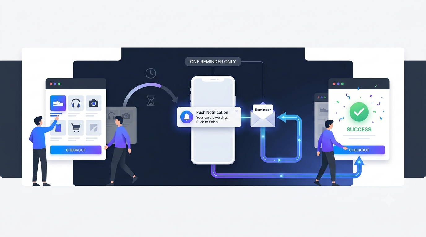
If you already sent a push about the same job, the in-app message should be the follow-through for people who opened the app without tapping — not a second copy of the same sentence.
Where Retainza fits
Retainza ships five layouts rendered by the SDK, plus a self-handled path that gives you the payload. Frequency caps, quiet hours and queueing are enforced for in-app the same way they are for push and email.